- Measuring Growth
- Reports
- Additional Resources
- Admin Help
- General Help
Teacher Diagnostic
Understanding the Report
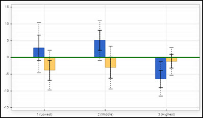
While the Teacher Value-Added report provides reliable measures of average student growth for the group of students served, the Teacher Diagnostic report offers important information about the growth of students at different achievement levels. This report can help teachers reflect on how the program and instruction are supporting the academic growth of all students. |  |
Achievement Groups
For information on how students are placed into and excluded from achievement groups, see Technical Details.
Growth
A simple growth measure is created for each achievement group. These values indicate the amount of academic growth students in the group made, on average, in the selected grade and subject or course. Use caution when interpreting these growth measures. Keep in mind that students are not weighted based on the teacher's instructional responsibility as they are for value-added reports. The values in this report are not the result of the statistically rigorous analyses that generate growth measures for the value-added reports. For more information, see Technical Details.
Expected Growth
Expected Growth represents the point at which the students' scores, on average, align with expectations.
Expected Growth signifies the minimum amount of academic growth that educators should expect a group of students to make in a subject and grade or course. In general, this signifies appropriate, expected academic growth. Simply put, the expectation is that regardless of their entering achievement level, students served by each district, school, or teacher should at least make enough progress to maintain their achievement level relative to their peers. This is a reasonable target for educators who serve all types of students. Expected Growth is represented by a horizontal green line in the graph.
Standard Error
All growth measures on the EVAAS reports are estimates. All estimates have some amount of measurement error, which is known as the standard error. This value defines a confidence band around the growth measure, which describes how strong the evidence is that the group of students exceeded, met, or fell short of expected growth.
For more information about standard errors, see Growth Measures and Standard Errors.
In this report, the standard error is represented by black whiskers on each bar in the graph. The solid lines of each whisker mark one standard error on either side of the growth measure, and the dotted lines mark two standard errors. For information about interpreting the charts, see Interpreting the Data.
Student Count
These rows list the number of tests in each group.
For more information, see Technical Details.
Percentage of Students
These values represent the percentage of this teacher's students who were in each achievement group. For example, if the teacher taught a relatively large number of higher-achieving students, the percentage for that group would be larger. If the teacher taught a relatively large number of lower-achieving students, the percentage for that group would be larger.
Filtering by Student Group
By default, the report includes all students the teacher taught in the selected grade and subject or course. You can use this filter to view the report for a subset of students.
To filter the list of students included in the report, click Filter by: Student Group above the graph. In the Student Groups window, you can choose any combination of race, gender, and demographic groups.
If you choose more than one group within a category, the report includes students who are in either group. For example, if you choose Black and Hispanic, the report includes both Black students and Hispanic students.
If you choose multiple groups across categories, the report includes only students who are in the selected groups in all categories. For example, if you choose Male and Students with Disabilities, the report includes only males who are identified as students with disabilities.
When you are finished making selections, click Submit. The report includes only those groups of students you selected.
Even when viewing a filtered group of students, placement of students into the achievement groups is still based on students' relative achievement to students in the selected grade and subject or course.
To remove a demographic from your list of filters, click the X next to the demographic. To remove all demographic filters at once, click Student Groups. In the Student Groups window, click Clear and then Submit. The report now includes all students in the selected grade and subject or course.
Viewing Bar Chart or Pie Chart
The bar chart is displayed by default. To change the chart from vertical to horizontal, choose from the Chart Orientation drop-down menu below the chart. To view the pie chart, choose from the menu below the chart.
The size of each pie slice represents the percentage of students who were in each of the achievement groups.
Color Coding
The slices of the chart are color-coded to indicate whether the data suggests that students in each achievement group exceeded, met, or fell short of expected growth. You'll find a legend for the color coding at the bottom of the report.
For information about interpreting the charts, see Interpreting the Data.