Decision Dashboard
Understanding the Report
The data in the Decision Dashboard is presented in two sections. The top section displays the value-added data as color-coded blocks. For each grade and subject or course, the report displays the growth measure color for the most recent year and for the three-year average, when available. If no three-year average is available, then the block is white. |
|
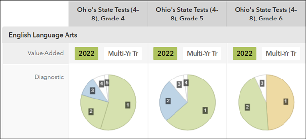
The diagnostic data appears in color-coded pie charts. The size of each slice in a pie represents the percentage of students in the School who were in each diagnostic achievement group for that grade and subject or course. The colors match the colors used on the pie charts in the School diagnostic report.
The bottom section is a table that displays the same information with color-coded symbols. You'll find a legend of the symbols below the table.
Highlighting
When you first view the report, highlighting is On by default. When you roll your cursor over either section, corresponding items are highlighted in both sections. For example, if you roll the cursor over the pie slice for Achievement Group 3 for a particular grade and subject or course, the Decision Dashboard will highlight the Achievement Group 3 pie slice for all grades, subjects, and courses and the Achievement Group 3 column in the table.
To turn highlighting off, click the Off button between the top and bottom sections. Pie chart animation is then limited to the selected pie chart, and highlighting is turned off for all other pies and for the table.
Grouping by Grade or Subject
When you first view the report, the data is displayed with each grade in a different column and each subject in a different row. Ohio's State Tests EOC subjects are displayed in the far-right column.
This grouping can be changed so that grades are displayed in columns and subjects in rows. To group the data this way, select Subject from the Group By menu.
Managing the Top Section
Restricting the Displayed Reports
By default, the top section displays data from both the value-added and diagnostic reports. To display only the value-added data or only the diagnostic data, choose from the Show Reports menu between the sections.
Restricting the Displayed Grades and Subjects
To remove a subject or grade from the graphs, click the X in the left column of the table next to the grade or subject you want to remove. That grade or subject will no longer be displayed in the top section of the report.
Click Remove All at the top of the bottom table to remove all grades and subjects from the top section. Click Add All to restore the display to once again include all grades and subjects.